• Design
  • Digital
  • Medical Illustrations
  • Digital Sculptures
  • About
Menu

Heidi Schlehlein

  • Design
  • Digital
  • Medical Illustrations
  • Digital Sculptures
  • About

Ishimoto Blog:

Integer posuere erat a ante venenatis dapibus posuere velit aliquet. Fusce dapibus, tellus ac cursus commodo, tortor mauris condimentum nibh, ut fermentum massa justo sit amet risus. 


Featured posts:

Summary Block
This block is invalid. Please check the block settings and try again.
Featured
Porta
August 23, 2026
Porta
August 23, 2026

Praesent id libero id metus varius consectetur ac eget diam. Nulla felis nunc, consequat laoreet lacus id.

Read more →
August 23, 2026
Etiam Ultricies
August 16, 2026
Etiam Ultricies
August 16, 2026

Donec id justo non metus auctor commodo ut quis enim. Mauris fringilla dolor vel condimentum imperdiet.

Read more →
August 16, 2026
Vulputate Commodo Ligula
August 9, 2026
Vulputate Commodo Ligula
August 9, 2026

Commodo cursus magna, vel scelerisque nisl consectetur et. Donec id elit non mi porta gravida at eget metus.

Read more →
August 9, 2026
Elit Condimentum
August 2, 2026
Elit Condimentum
August 2, 2026

Lorem ipsum dolor sit amet, consectetur adipiscing elit. Vestibulum id ligula porta felis euismod semper.

Read more →
August 2, 2026
Aenean eu leo Quam
July 26, 2026
Aenean eu leo Quam
July 26, 2026

Quisque iaculis facilisis lacinia. Mauris euismod pellentesque tellus sit amet mollis.

Read more →
July 26, 2026
Cursus Amet
July 19, 2026
Cursus Amet
July 19, 2026

Sed purus sem, scelerisque ac rhoncus eget, porttitor nec odio. Lorem ipsum dolor sit amet.

Read more →
July 19, 2026
Pellentesque Risus Ridiculus
July 12, 2026
Pellentesque Risus Ridiculus
July 12, 2026

Vivamus pellentesque vitae neque at vestibulum. Donec efficitur mollis dui vel pharetra.

Read more →
July 12, 2026
Porta
July 5, 2026
Porta
July 5, 2026

Praesent id libero id metus varius consectetur ac eget diam. Nulla felis nunc, consequat laoreet lacus id.

Read more →
July 5, 2026
Etiam Ultricies
June 28, 2026
Etiam Ultricies
June 28, 2026

Donec id justo non metus auctor commodo ut quis enim. Mauris fringilla dolor vel condimentum imperdiet.

Read more →
June 28, 2026
Vulputate Commodo Ligula
June 21, 2026
Vulputate Commodo Ligula
June 21, 2026

Commodo cursus magna, vel scelerisque nisl consectetur et. Donec id elit non mi porta gravida at eget metus.

Read more →
June 21, 2026

Type Workshop

June 04, 2017

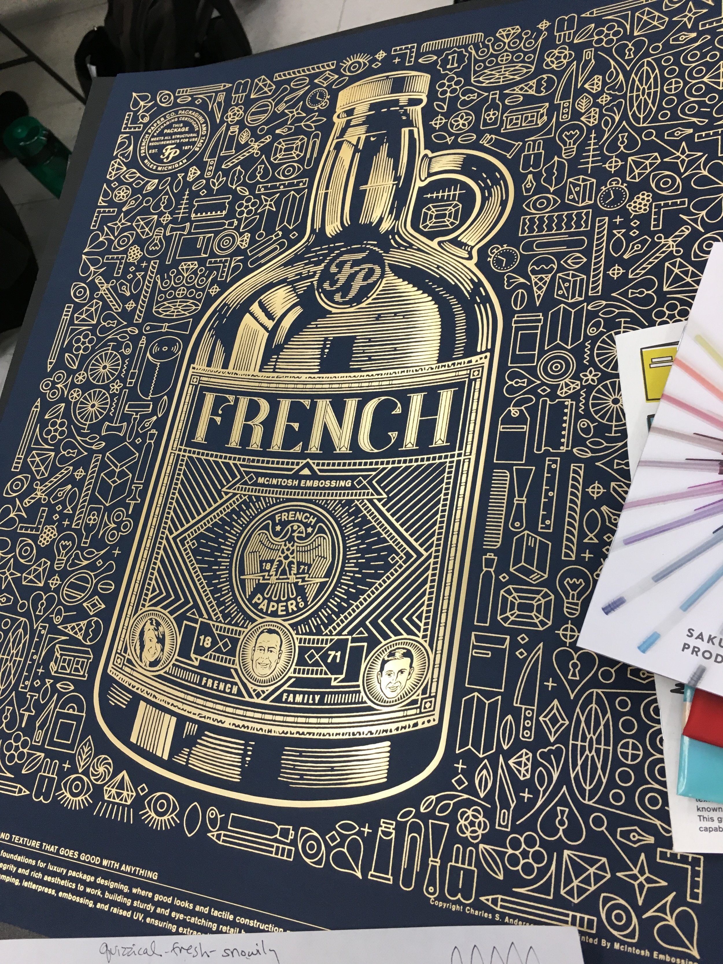
I attended a workshop called Type Speaks by Association of Illustrators and Graphic Artists-Wisconsin featuring hand-letterer and type extraordinaire, James T Edmondson. Held in the Art Building at the University of Wisconsin-Milwaukee, a bunch of us gathered to learn all about type creation. I was excited to learn more about fonts and lettering, and basic rules and classic fonts as a springboard for creating my own type.

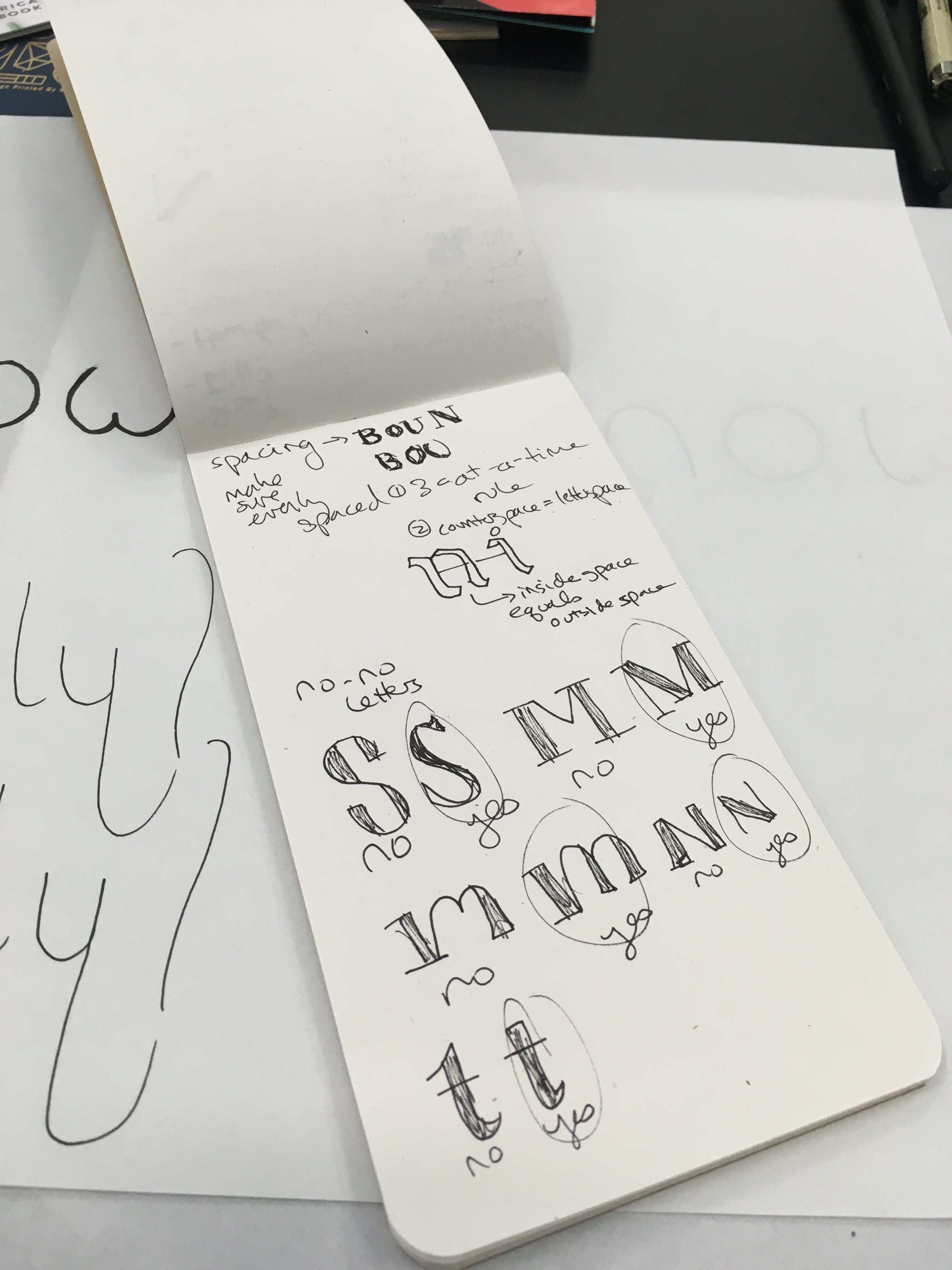
James spent the first hour walking us through a zine that he created on basic rules for weight, contrast, width, stems, construction, optical size, contrast type, stroke endings, and ascenders/descenders. As he broke down each part, it was apparent that type is a science, and creating fonts is like a balanced chemical equation- adhering to design rules- or breaking them intentionally- are elements that create a great font.  

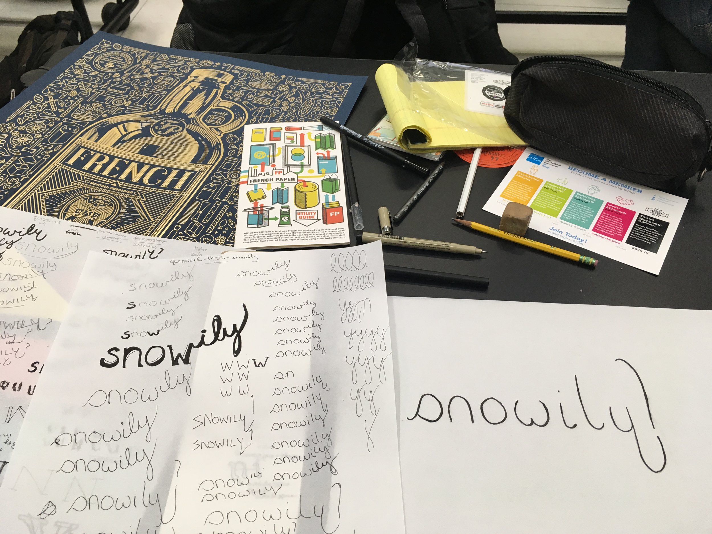
The rest of the time was spent creating our own type. We were each randomly given two adjectives and one word. The instructions were to write the word in a way that the adjectives described. My adjectives were quizzical and fresh, and my word was snowily. I started writing the word on an upward slant, to mimic when the voice rises at the end of a question (quizzical) and playing around with a fresh looking weight. The upward slant looked weird, so I settled on having the descender on the y curve the opposite way and adding a hint of a question mark, which may have been overkill.

After an hour or so of this, we hung up all our types and critiqued them one by one. The major take-away with my type was to bring the middle part of the w up to the height of the other strokes so it would look less like a butt- oops! Something I had seen but wasn't sure how to fix until the feedback in critique. Everyone had a different-looking word and type, and it was fun to see all the different takes. I might do this in the future just for a fun exercise. It's a great way to think creatively within the bounds of letters, a directed sort of sketch. 

The workshop was time well spent- I learned a lot about fonts and type creation, and enjoyed creating letters with fellow artists. James was an excellent teacher and I appreciated learning a new skill. I also really liked working creatively away from a computer, which is something that I need to go out of my way to do more often! A big thanks to AIGA for organizing the workshop. Learning never ends.
 

← CID Certification
Back to Top

email: hschlehlein@gmail.com
phone: (262) 994-7511